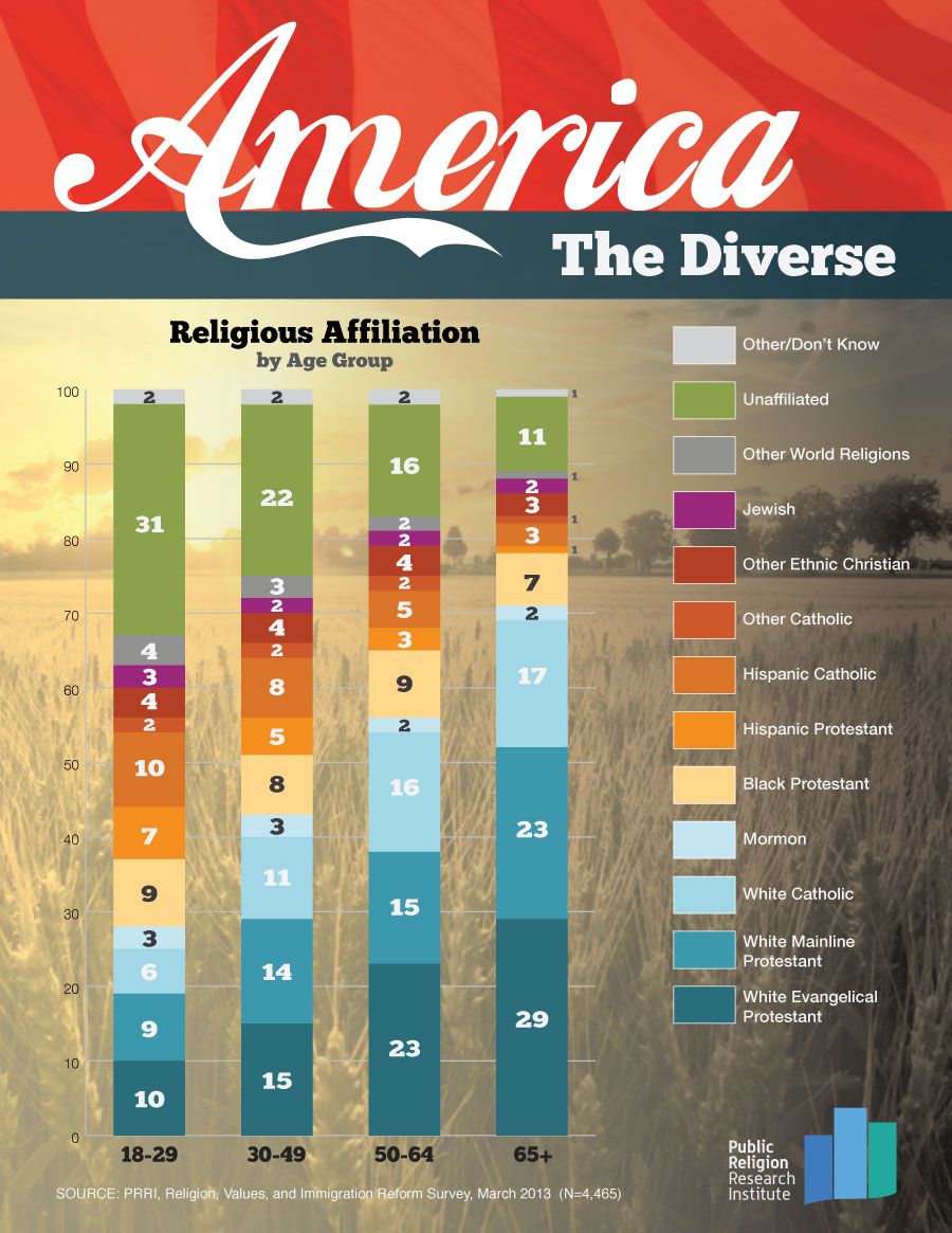
Last week’s graphic of the week from the Public Religion Research Institute is titled America the Diverse. In the days since it was posted, I have returned to it several times and referenced it in multiple conversations.
So What?
The information contained on this graphic isn’t news to those who follow generational trends. It is, however, important data for congregational leaders to consider as they plan for the future.
Currently, I serve two mainline congregations comprised primarily of those over age 65. Leaders in both parishes are quite aware that younger generations don’t have the same level of religious affiliation in general nor with the mainline as does their generation.
- Which age group comprises the largest percentage of the adults who are actively involved in the life of your congregation?
- Is the group that is the largest within your church the same as the group that is the largest in the geographic area surrounding your church campus? If not, is a part of your congregation’s long range planning focused on welcoming the dominant age group just outside your walls?
- What is your main take away from an awareness that as you move from the oldest to youngest adult generations the percentage of people who are unaffiliated increases while the percentage who affiliate with mainline churches declines?
