Two days ago, Chris Taylor wrote an intriguing opinion piece on Mashable suggesting that the new Facebook is too complicated. He suggests that feature creep has made the once simple interface increasingly and unnecessarily complex. The following are among the latest changes that he considers as support for his argument:
- Addition of a ticker
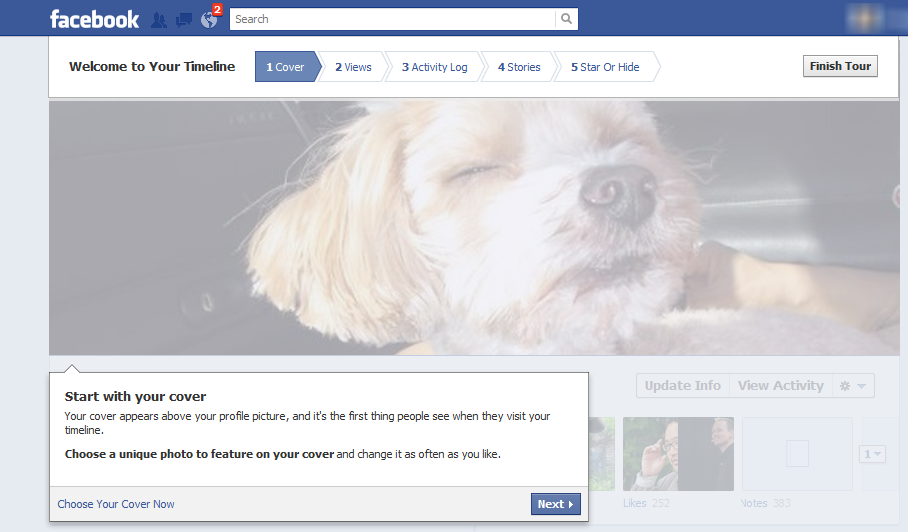
- Redesign of user profiles via timeline
- Shift from a like button to gestures that will allow users to [any verb] a [any noun]
- Shift from lists as a means of excluding some people from certain content to a means of including (creating two different kinds of lists in the process)
So What?
I was an early adopter who opted to voluntarily complete the required steps to manually activate my timeline before it launched automatically. According to Taylor’s estimate, this makes me part of the top 1% of users. As such, it may seem that I am not well positioned to speak to how most people will respond. However, I have considerable experience teaching people, both in a classroom context and informally, about Facebook. As a result of those experiences, I agree that the recent shifts add unnecessary complexity that could well result in decreased usage by a considerable number of users who are not inclined to learn how to participate in the new environment.
- What is your overall opinion of the new Facebook?
- Would you prefer the new features were options you had to “turn on” rather than changes that occur automatically?
- Assuming you agree that the “less is more” simplified approach that was in place as Facebook grew to its current user base of some 800 million accounts, what lessons can your local congregation learn from both that early success and the latest changes as they relate to your congregation’s use of new technology in general and inclusion of web 2.0 tools on its primary website?
