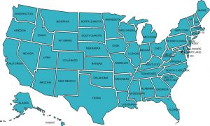
 I regularly hear people make assumptions about wealth and income. I encourage my readers to take a look at a powerful tool provided by the New York Times that allows you to input an annual household income figure then see how that amount ranks compared to those in one or more of 344 different zones or areas across the country.
So What?
I entered several figures and found both how that income level compares to others in the nation and in my local area. Here are a few examples:
|
Annual Household Income |
National Ranking |
Local Ranking |
|
$8,000 |
Bottom 5% |
Bottom 4% |
|
$15,000 |
Bottom 13% |
Bottom 9% |
|
$25,000 |
Bottom 24% |
Bottom 19% |
|
$40,000 |
Bottom 39% |
Bottom 35% |
|
$60,000 |
Top 43% |
Top 47% |
|
$85,000 |
Top 27% |
Top 32% |
|
$125,000 |
Top 13% |
Top 18% |
|
$200,000 |
Top 5% |
Top 10% |
Is your local area a place where income levels are greater than, less than or right around the national average? Is it a place where income inequality is greater than, less than or right around the national average? Why does an awareness of this information matter to you as a person who follows the way of Jesus?